

SENIOR CAPSTONE 2024
MONSTERPALOOZA REBRAND
Proposal:
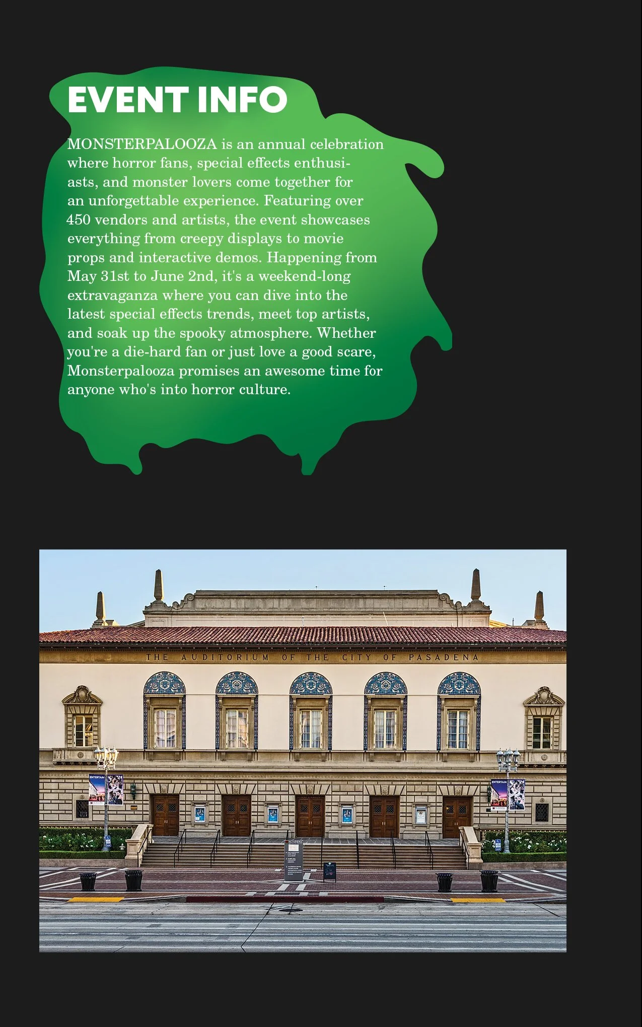
Monsterpalooza is a horror-themed convention held in Pasadena, California, focusing on horror, creatures, and makeup work. The event originated in New Jersey in 2008 and moved to the West Coast in 2009. The event has guest appearances from celebrities and practical effect designers. The current brand image, however, doesn’t quite reach its target audience, lacks a certain design form, and the website lacks a user-friendly experience. As a solution, I have made a redesign of the convention that both caters to its intended audience and allows for a smoother, more user-friendly experience.
The aim of this redesign is not only to reacquire the desired audience but also to provide needed advertisements and refined ways of providing information about the convention. The redesign entails a logo, three posters, a ticket design for memorabilia purposes, a website redesign, and a brochure that will include a map of the event. This rebrand is meant to give the target audience easier access to the event's content and increase sales through advertisements.
The key target audience is horror genre enthusiasts around 15 – 44 years old, with more appeal to the male demographic, although the female demographic is growing. Statistica states, “As of October 2022, almost two-thirds (64 percent) of adults aged 30 to 44 surveyed in the United States said they either liked or loved the horror movie genre. Among respondents aged 18 to 29, that share was 10 percentage points lower, at 54 percent.” Although the audience is mostly 18-44 years old many 15–17-year-olds are allowed to see these movies with an accompanying adult or guardian. This target audience has focused on the Gen Z group who enjoy the stimulation and content that horror movies have provided.
Deliverables:
1 Colored Logo Redesign
3 Poster Designs (27”x 40”)
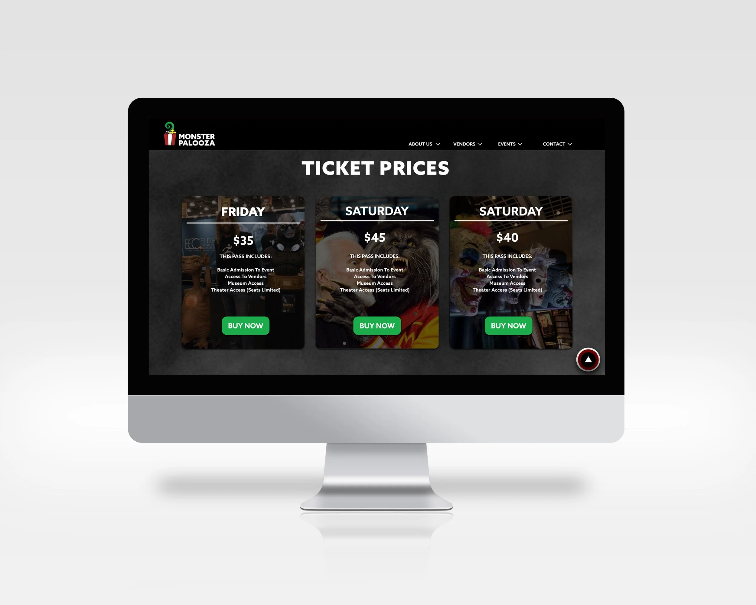
Website Redesign
Homepage
About Us
Vendors
Events
Contact
To independently research, design, and produce a logo, three poster designs, a website, a ticket design, and a pamphlet for MONSTERPALOOZA.
To self-evaluate and interpret designs throughout the design process to improve the quality of work.
To develop a redesign of MONSTERPALOOZA that is cohesively successful across all deliverables.
To comprehend and apply critique from peers and instructors whenever necessary.
To produce a cohesive, successful design across all deliverables.
To produce all deliverables with perfect craft.
To produce a presentation that cohesively and thoroughly explains the rebrand of MONSTERPALOOZA.
Objectives:
Ticket Design (5.5” x 2.125”)
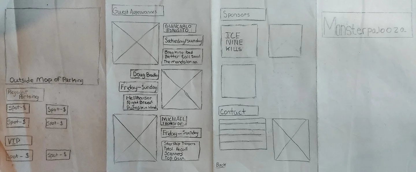
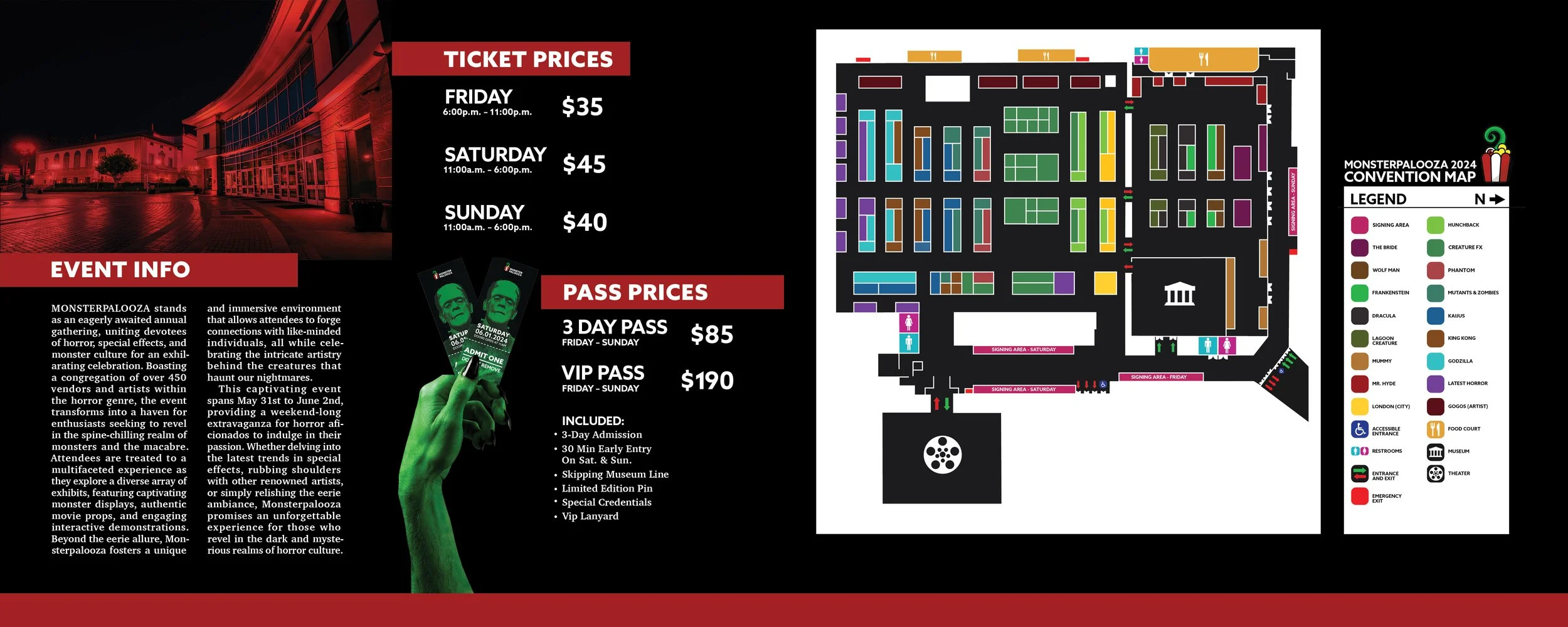
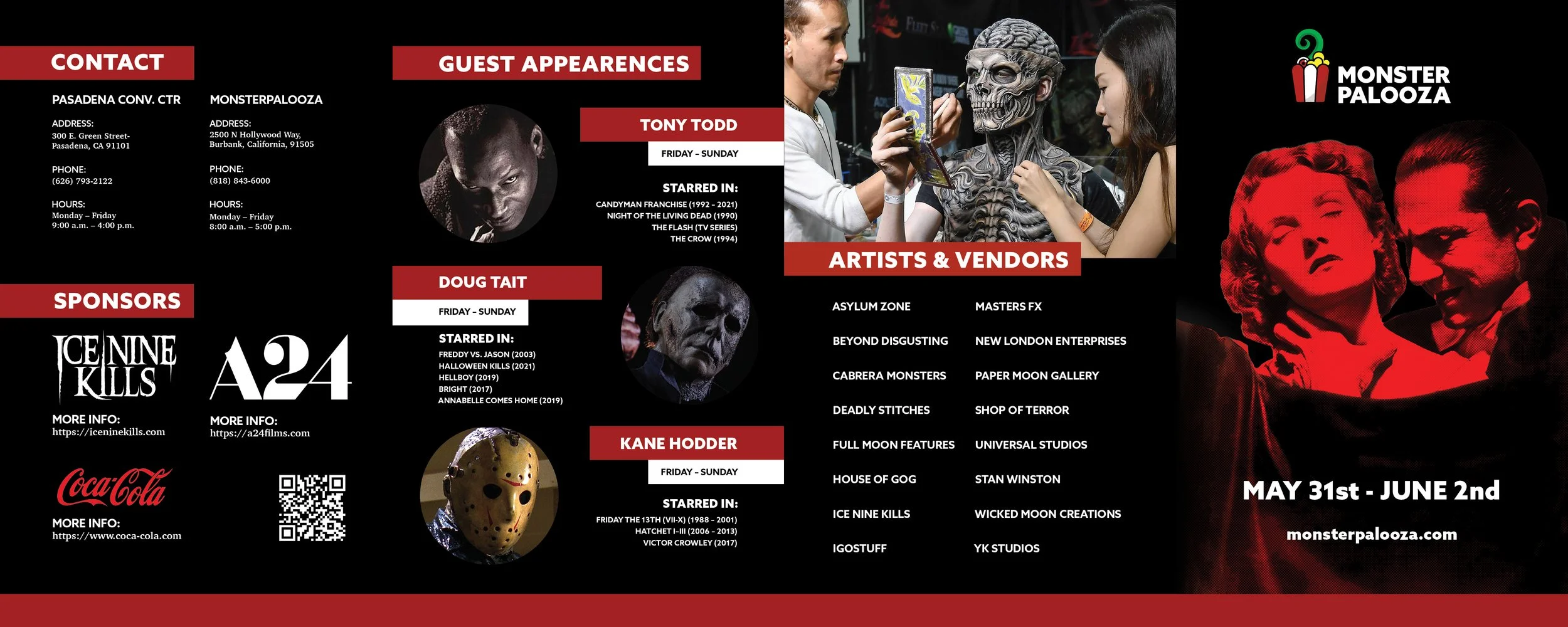
Brochure
Event Info
Ticket Information
Artist and Vendor Info
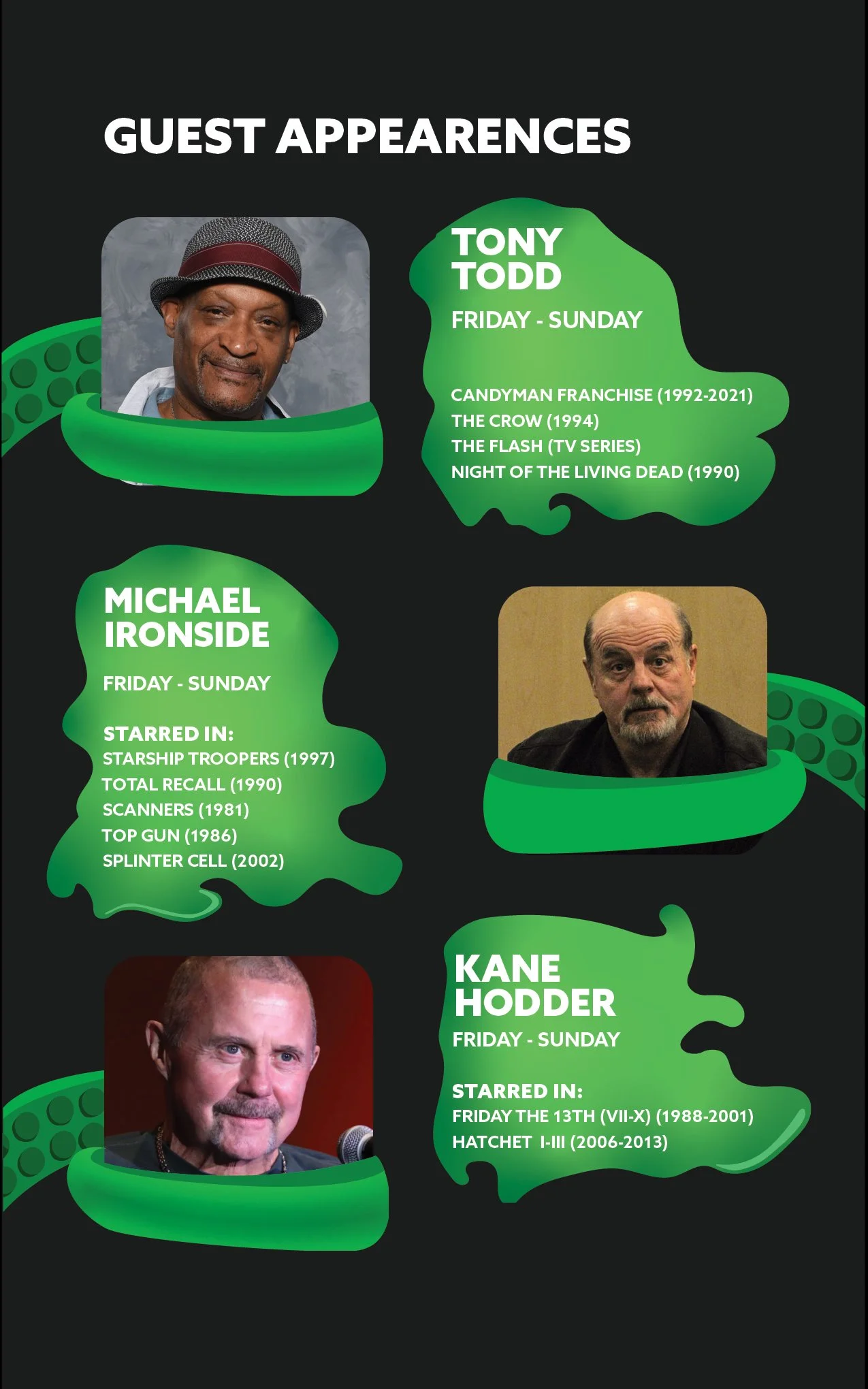
Guest Appearances
Sponsors
Map of Event
Contact Info
Logo:
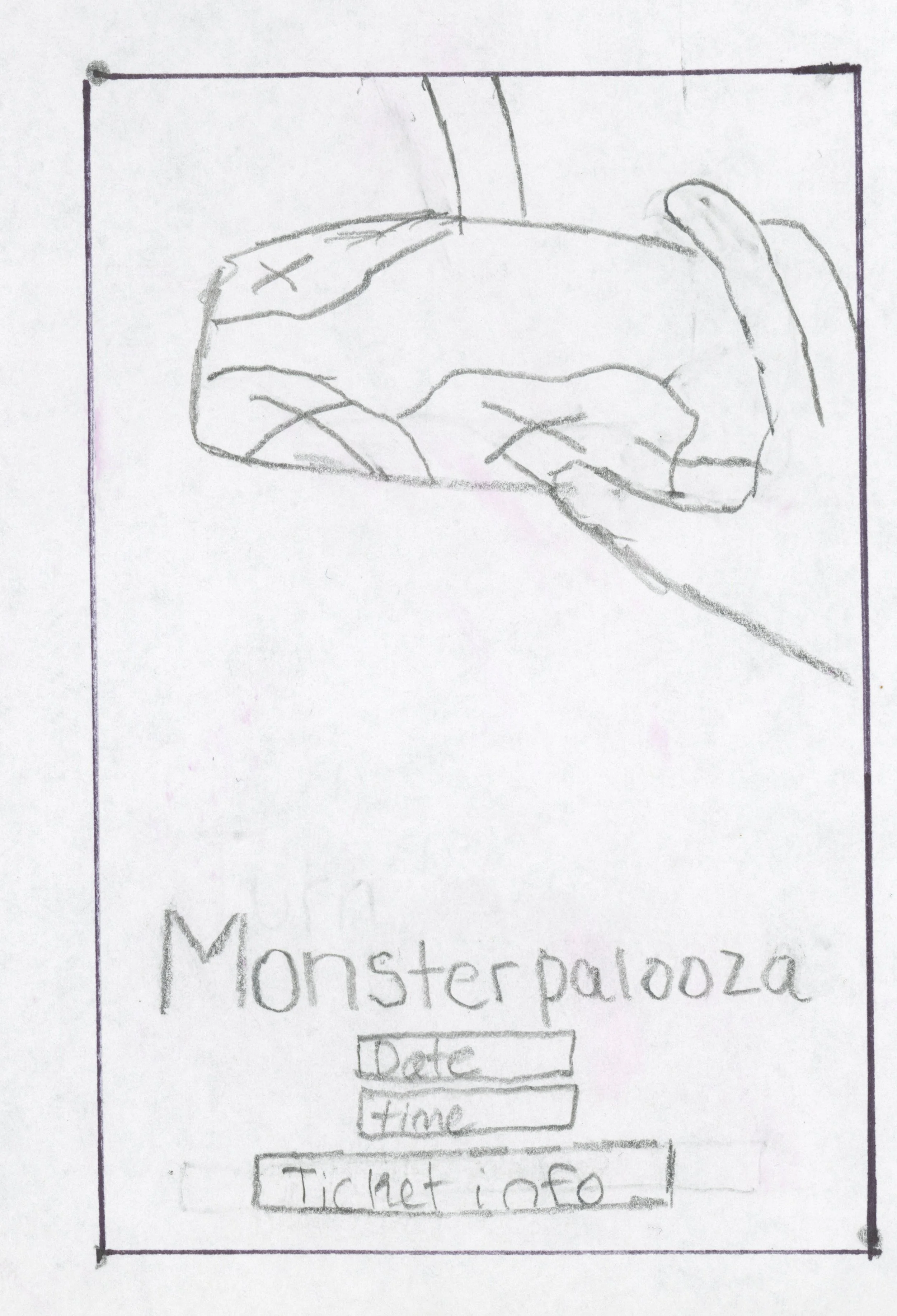
For my logo, I wanted to go for a surprise factor when creating my thumbnails. I thought about the idea of a hand coming out of something like a film reel and popcorn bucket. Eventually, I realized that the idea would be difficult to render and too unrecognizable as a logo. I chose to rethink the design and what would be surprising to find and landed on a tentacle. The tentacle let me simplify the logo down a large proportion and thought maybe adding eyes as popcorn could be interesting. I tried adding slime and squeezing the box to add more action to the tentacle. Realizing that wasn’t the best option I, tried to make the popcorn box more cut off and focused on the interaction at the top. When finding my type, I also decided to change how you would read Monsterpalooza, making it two separate words. I wanted it to use a bold font that matched the style of the logo and decided on one called “Azo Sans.” I started thinking about how I would render the design, deciding on more of a sticker approach with an outline.

Logo Color:
When thinking about the colors, I started to think making a logo that used saturated colors could help in making the box and tentacle more recognizable. Another factor I had to contend with was that the sticker design would have more vibrant colors instead of dull or muted colors.

Posters:
After finalizing the logo, I moved on to creating 3 posters that advertised the event and played on tropes of horror movies of the past century. The overall size for the posters was 27” x 40”, which is the size of a movie theater poster. I wanted these to feel as though they were taken straight out of the movie theater with how they were designed. I also wanted the taglines to be somewhat funny compared to the subject matter.
For the first poster, I wanted to place multiple different hands on the door to play on the trope of the monster inside the house. I later decided one hand would be sufficient in providing context and fear. The colors were based on movies like Suspiria and Color Out of Space which use very dynamic colors to portray feelings like fear and loneliness.
For the second poster, I wanted to play on childhood fear expressed when seeing the monster below the bed. For this, I originally wanted to put a hand or face with detail, but decided that the aesthetic would be better with simply sharp and animal-like eyes.
For the final poster, the idea of a presence behind you was the intention like the killer in the car with you. The use of a completely dark scene was to invoke an ominous presence. I wanted the viewer to have a similar fear with them.


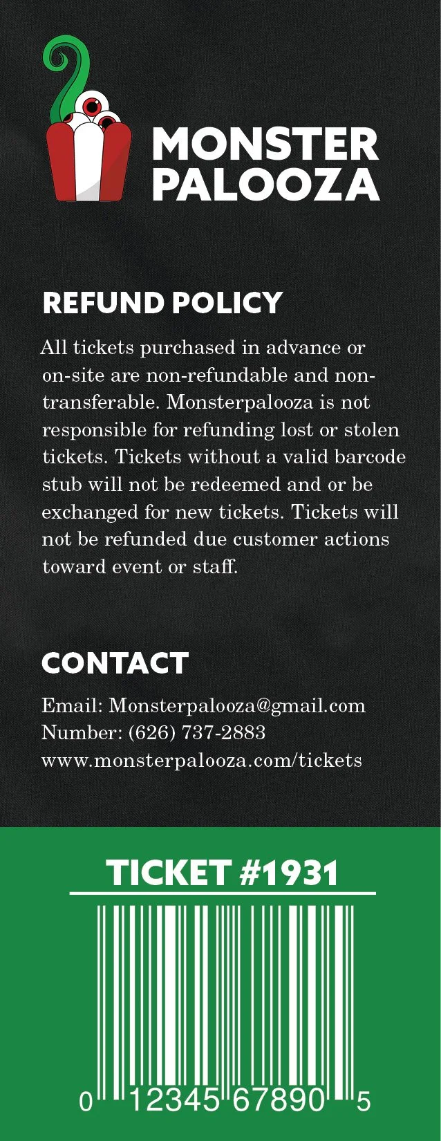
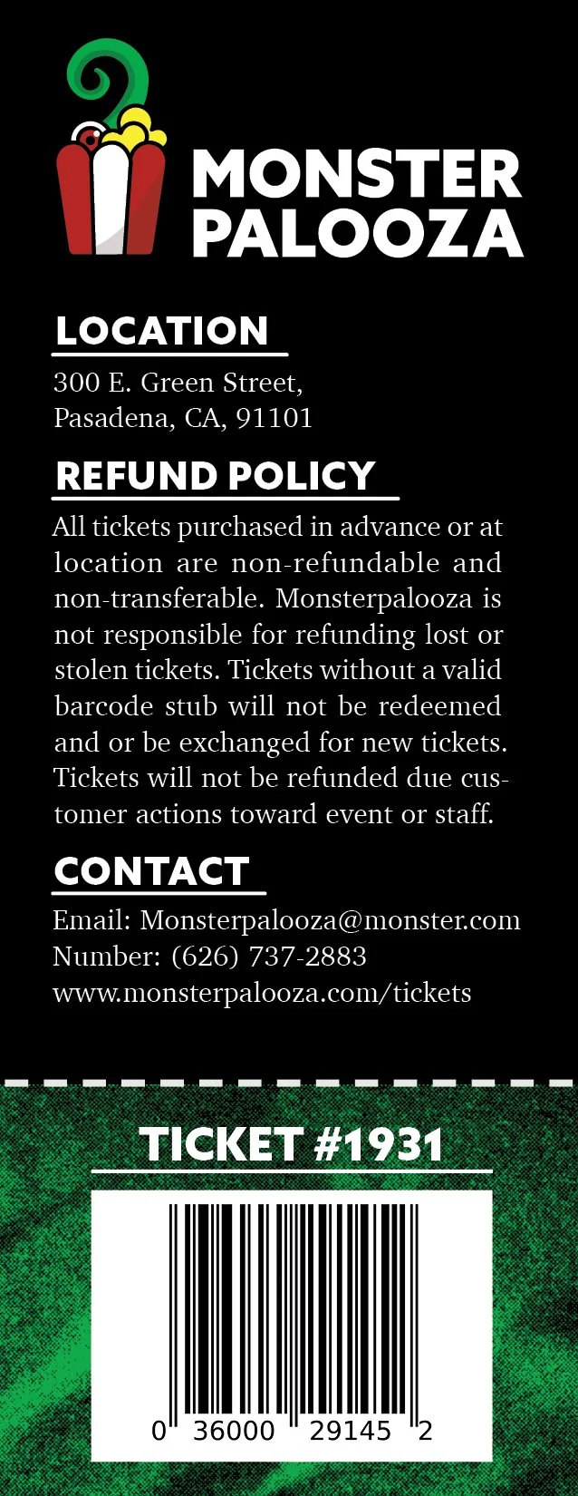
The ticket was crucial to this rebrand due to the memorabilia aspect that a ticket can provide. When first thinking of what the design would be, I thought of a film reel that had a hand reaching out of one of the slides. I began to realize that the design was not working and began rethinking individual icons and/or making one of the poster designs a ticket. For the current and final design, I chose to work with an original photo from the 1931 movie Frankenstein. I wanted the target audience to not only see a recognizable face of horror but also show that the event doesn’t specifically include monsters from the past two decades. When designing the ticket, I also realized that if Monsterpalooza chose to expand their ticket designs, they could create a series using a color and monster theme.

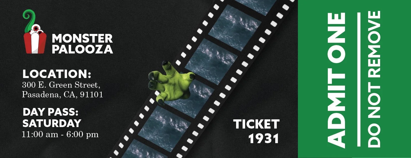
Ticket Design:

Brochure Design:


Final Products:
Logo


Ticket Front
I wanted to create a brochure that not only showed information on the event but acted as an interesting piece of memorabilia for those interested. When designing the brochure I tried to use the tentacles I had previously had in my logo to tie the two together, however, the design felt too childish. I would add more frightening imagery to the final to fill in the space more evenly. The front page uses a similar style to the tickets with the use of halftoned horror creatures being at the center stage.


Poster #1
Brochure Pgs 5-8
Website


Poster #3

Ticket Back


Poster #2
Brochure Pgs 1-4
Process Narrative:
Research Synopsis:
Due to Monsterpalooza's existence for more than 15 years, much of the information on the event was easy to find. I have a personal affinity for movies' horror and creature genres. I started my research by gathering information such as the origin of the event's origin event and who would be the guests for this year’s event. I also began to think of how I would make all deliverables a part of a consistent brand and decided to work with the idea of cliches in horror and surprise.
Next, I researched horror demographics, finding a range of 15-44-year-old males to enjoy horror the most. This helped me find what the younger generations enjoy. The next items I researched were how my posters would look and be observed. For this, I looked at many horror movie posters such as Malignant(2021), Suspiria(1977), and Evil Dead (1981). All posters have both surprise and cliches like the monster under the bed or the man behind you. Working with this in mind I began researching brochure designs to help in laying out all the information.